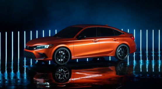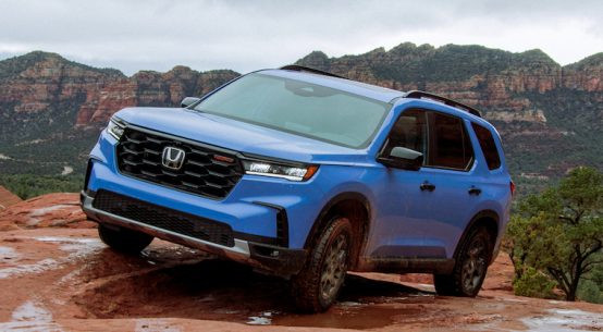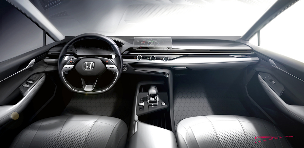
In a video released this week (see below), Honda showcases a new interior design philosophy that will shape the interior design of future Honda models. Johnathan Norman, Creative Lead for Honda Interior Design in the U.S., provides insight into the new philosophy behind the interior design direction.
Inspired by the classic human-centered designs of early Honda vehicles, the brand’s new simplicity and “something” philosophy helps enhance the driving experience by eliminating complexity and advancing the user experience through thoughtful and pleasing design elements. The new design philosophy features a renewed focus on Honda’s classic “Man Maximum/Machine Minimum” approach that maximizes cabin space, while minimizing space required for mechanical components.
“Simplicity in design requires not only a strong philosophy, but a discipline toward the user experience,” said Norman. “We’ve heard from designers working for other brands who say they were inspired by the simple, human-centered design of old Hondas. Well, so are we!”
For Honda, this means interior design is about the people inside the vehicle, leading to interiors free of visual clutter with a focus on thin pillars, a low cowl and a large greenhouse for excellent visibility, enabling the driver and occupants to see the road and the environment around them.
The “and something” is the personality and character of the design meant to invoke a positive emotional response from the driver and passengers, expressed through design details such as the careful knurling of a knob or charm of a material.
Norman notes the “simplicity” philosophy will be the design language of Honda, while the “and something” is the personality and appeal unique to each model. “We are pursuing this design language with the new Hondas we’re designing in the studio now,” he said. “It’s our ‘simple’ approach to design with the ‘and something’ that will help differentiate each product and make your future Honda vehicles something you want to drive and are excited to use.”
